FABP4
LOC401286
AGER
LYVE1
SH3GL3
PYCR1
TCF21
FMO2
ITLN2
CLEC1A
MMRN1
ADH1B
CAV1
PECAM1
EDNRB MetaEnrichGO Practical Example
This document provides guided, step-by-step examples illustrating how to use MetaEnrichGO for functional enrichment analysis across multiple gene lists. It aims to demonstrate both basic and advanced functionalities of the tool through practical workflows. The structure of the document is as follows:
- Overview
- Basic Example: KEGG Enrichment with one Pasted list
- Input
- Parameters
- Data Visualization
- Outputs
- Advanced Example: GO Biological Process Enrichment with Filtered Example Data
- Input
- Parameters
- Data Visualization
- Outputs
1 Overview
Two example use cases are presented:
Basic Example — Performs enrichment against KEGG pathways using a custom list of human genes pasted directly into the tool. This example highlights the core functionality of MetaEnrichGO and the steps required for a quick analysis and download of key results.
Advanced Example — Focuses on enrichment using the GO Biological Process ontology, employing example gene lists with stricter filtering criteria. It showcases table-to-plot interactivity, filtered result exploration, and extended visualization features.
Each example includes detailed parameter choices, explanations of their relevance, and instructions for interpreting and exporting the results.
2 Basic Example: KEGG Enrichment with Pasted Data
Objective: Identify the top 20 KEGG terms pathways enriched in a customised set of human genes introduced through the pasting option.
2.1 Input
Check ℹ️ Format: The information icon and the placeholder of text input reveals the required
###delimited structure. Verify the example closely to match one gene per line with no headers.Mode selection: Choose
Paste Genesfrom the input method menu.Pasting data: Insert a single-column text file containing one list of up to 15 genes. Duplicate entries and missing values are automatically removed. If multiple genes are present on the same line (e.g.,
BRCA1///BRCA2), only the first one is retained.
Note
Even if the entire pasted content is not fully displayed within the text box, the application processes it completely.
2.2 Parameters
The analysis options selected to achieve the objective are as follows:
| Parameter | Setting | Rationale |
|---|---|---|
| Database | KEGG | Focuses on well–curated metabolic and signaling pathway maps, ideal for translating gene sets into pathways. |
| Organism | Homo sapiens (Hsa) | Ensures correct mapping of human HGNC symbols (e.g., TP53). |
| Gene ID type | SYMBOL | Matches the pasted gene identifiers, preserving original nomenclature without conversion. |
| Meta-analysis method | Not visible | Meta-analysis with only one list not available. |
| Minimum number of datasets | Not visible | Minimum number of datasets with only one list not available |
Table 1: Basic Analysis Configuration. Selected parameters for the single-list usage example, targeting the KEGG database with Human gene symbols.
2.3 Data Visualization
Once the parameters have been configured, attention turns to the output visualization section (Data Visualizaction), where both the resulting table and plot can be fully customized.
| Setting | Configuration | Details |
|---|---|---|
| Columns | ID, Description only | All other columns deselected so that table output focuses on pathway identifiers and names. |
| Number of terms to show | 20 | Displays the top 20 enriched pathways in the plot. |
| Y-axis label | ID | Shows the KEGG pathway IDs on the vertical axis for clarity. |
| Plot type | Dot Plot | Chosen for compact representation of significance and counts. |
| Color Scale | Low: light blueHigh: dark blue | Gradient mapped to adjusted p-value; defines low (less significant) and high (most significant). |
| Text size | 10 pt | Balances readability with plot aesthetics when displaying 20 entries. |
Table 2: Visualization Settings. Customization parameters applied to the results table and plot to prioritize pathway identifiers and optimize the display of the top 20 enriched terms.
Once customization is complete, pressing the Run Analysis button initiates the Over-Representation Analysis (ORA), applies the selected meta-analysis method, constructs the final results structure, and renders both the interactive table and the corresponding plot in the Data Visualization tab.
Tip
Table and plot customizations can also be performed after analysis completion; any changes to columns, filters, or visual settings will be applied immediately without re-running the analysis.
2.4 Outputs
2.4.1 Enrichment Table (Interactive DataTable that shows the final result of our analysis)
Displays only
IDandDescription.Downloaded as
tsvvia the export button.The downloaded results are represented again in the form of an interactive table to simulate the results obtained in the web tool.
Table 3: Basic Analysis Output. Tabular results generated from the single-list example, displaying the significant enriched terms and their associated statistics.
2.4.2 Excluded table
Since a single list was used, no terms were excluded.
2.4.3 Dot Plot (png)
Renders the top 20 terms pathways along the Y-axis with dot size/color indicating significance.
Downloaded as a static
pngimage.
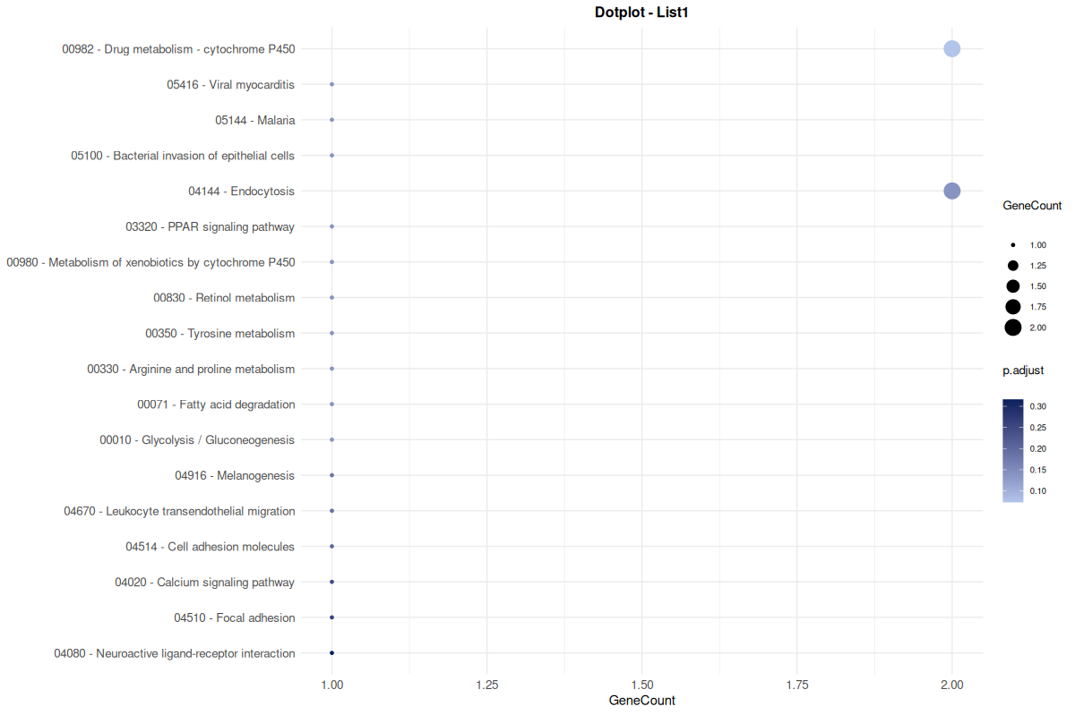
Figure 1: Basic Analysis Dot Plot. Static visualization of the top 20 enriched pathways, where dot properties correspond to statistical significance and gene count.
3 Advanced Example: GO Biological Process Enrichment with Filtered Example Data
Objective: Perform a GO Biological Process (BP) enrichment analysis using example human gene lists, applying stricter appearance filtering and leveraging table-plot interactivity for refined exploration (search for the word ‘cell’ in description).
3.1 Input
Mode selection: Select
Upload Filesand enable theUse Example Dataswitch to load the four predefined.txtgene lists included in the tool.Download option: These files can also be downloaded for inspection or adaptation in other projects.
Origin of the data: The example lists are derived from four independent human lung cancer studies, each available through the GEO database:
- GSE10072: Contains gene expression profiles comparing tumor and adjacent normal lung tissues from patients with pulmonary adenocarcinoma.
- GSE19188: Includes expression data from 91 tumor samples and 65 normal controls covering various NSCLC histological types (adenocarcinoma, squamous cell carcinoma, large cell carcinoma).
- GSE63459: Features paired tumor and normal lung samples from 31 patients diagnosed with lung adenocarcinoma.
- GSE75037: Provides gene expression profiles from lung tissue samples in patients with non-small cell lung cancer (NSCLC).
Note
This configuration represents a multi-cohort scenario ideal for identifying biologically meaningful and consistently enriched terms across different datasets. Each file is treated as an independent list.
3.2 Parameters
The analysis options selected to achieve the objective are as follows:
| Parameter | Setting | Rationale |
|---|---|---|
| Database | Gene Ontology (GO) | GO provides comprehensive coverage of biological annotations. |
| Ontology | Biological Process (BP) | BP targets pathways and biological activities, ideal for assessing higher-level gene function. |
| Organism | Homo sapiens (Hsa) | Matches the identifiers used in the example datasets. |
| Gene ID type | SYMBOL | Example files contain numeric NCBI IDs (e.g., 672 for BRCA1). |
| Meta-analysis method | Wilkinson |
By using the k-th smallest p-value, Wilkinson balances sensitivity to consistent moderate signals. |
| Minimum number of datasets | 3 | Ensures terms are supported by at least 3 of 4 lists, reducing spurious signals and improving reliability. |
Table 4: Advanced Meta-Analysis Configuration. Selected parameters for the multi-dataset scenario, utilizing the Wilkinson method and a high recurrence threshold to identify robust Biological Processes.
3.3 Data Visualization
Once all parameters are configured, visualization adjustments are made to tailor the output and highlight meaningful results.
| Setting | Configuration | Details |
|---|---|---|
| Columns | ID, Description and GeneCount | All other columns deselected so that table output focuses on terms of biological process and genes. |
| Number of terms to show | 10 | Maintains visual clarity while allowing coverage of most significant entries. |
| Y-axis label | ID + Description | Combines both ID and label for clarity when displaying filtered results. |
| Plot type | Dot Plot | Compact representation well-suited for comparative significance across terms. |
| Color scale | Low: light grey, High: red | Color gradient mapped to p.adjust, emphasizing more significant results with stronger hues. |
| Text size | 12 pt | Increases legibility due to longer combined axis labels. |
Table 5: Advanced Visualization Settings. Customization parameters applied to focus the output on the top 10 consensus terms, utilizing combined axis labels and a high-contrast color gradient to emphasize statistical significance.
Once customization is complete, pressing the Run Analysis button triggers the enrichment workflow. This includes executing the Over-Representation Analysis (ORA), applying the Wilkinson method to combine p-values across datasets, correcting for multiple testing, and rendering both the interactive table and the corresponding plot. The results appear immediately within the Data Visualization panel.
After the table is generated, column-specific filters become available through the DataTable interface. These filters adapt to the type of data in each column: if the content is textual, it allows keyword-based filtering; if numeric, it enables interval selection.
Given the objective of this example, we start by filtering the Description column using the keyword “cell”. This action instantly updates the plot to display only the matching biological processes. To refine the results further, we apply an additional filter to the GeneCount column to include only terms associated with 20 or more genes (>= 20).
Tip
All visual adjustments—such as column selection or plot settings (except the data column filtering)—can be made either before or after the analysis is run. Any changes are applied immediately without re-running the analysis.
3.4 Outputs
3.4.1 Filtered Enrichment Table (Interactive)
The main table now displays columns for
ID,Description, andGeneCount, but only includes entries that contain the keyword “cell” in theDescriptioncolumn and have aGeneCountof 20 or higher.The filtered data is exported as a
csvfile containing all visible columns associated with the selected terms. In this case, four terms match the criteria.
Table 6: Filtered Advanced Analysis Output. Tabular results displaying the specific subset of enrichment terms matching the user-defined criteria (keyword ‘cell’ and GeneCount ≥ 20), demonstrating the interactive filtering capabilities.
Alongside the overall results table, a separate table is created for each input list included in the analysis. Each list produces both a results table and a plot, but only the table is shown in this example:
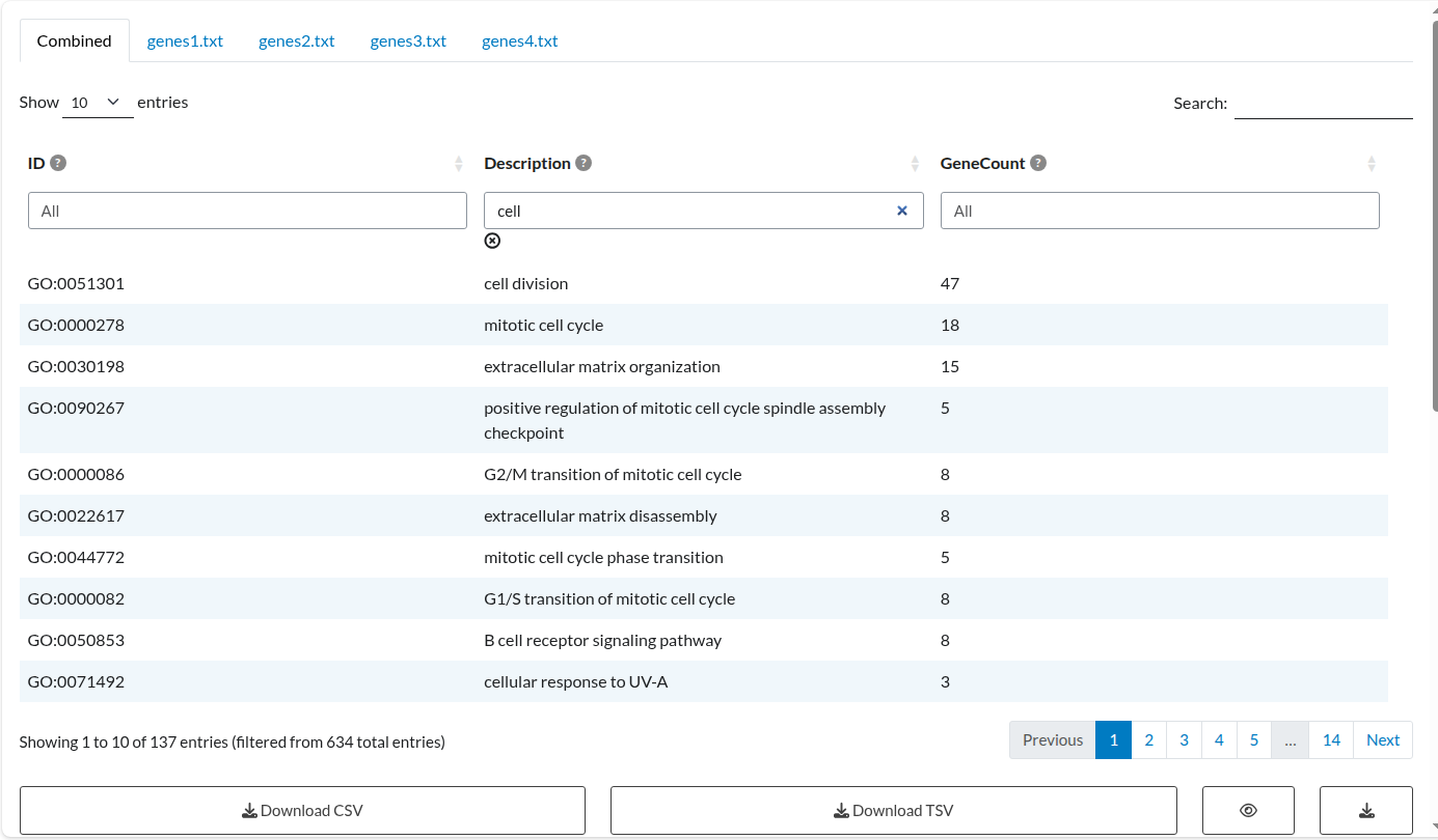
Figure 2: Combined Meta-Analysis Results. Consensus table displaying the aggregated enrichment terms, including combined p-values and recurrence counts across the four study datasets.
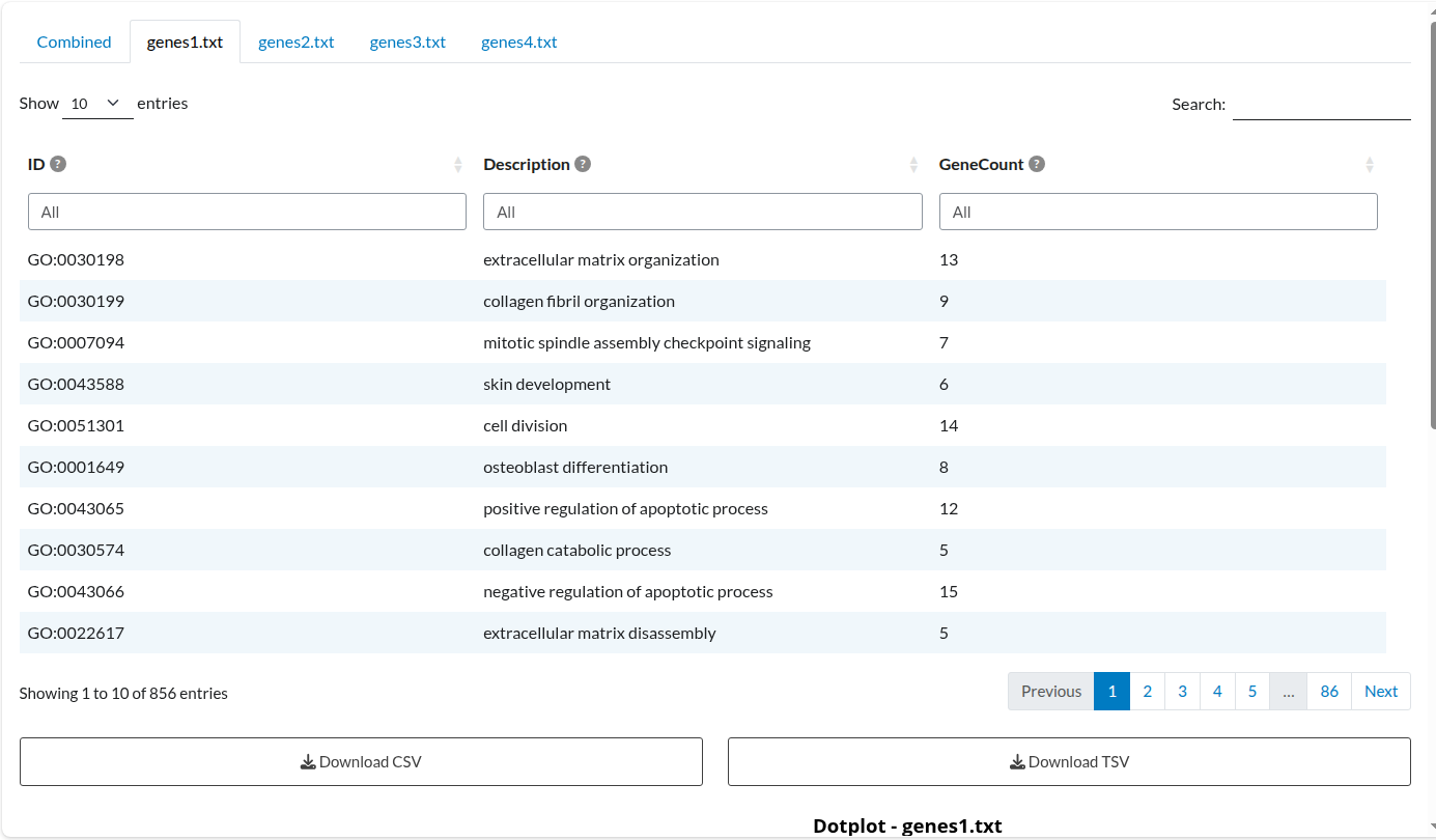
Figure 3: Individual Analysis: Dataset 1. Independent enrichment results for the ‘genes1.txt’ list, displaying term significance specific to this study.
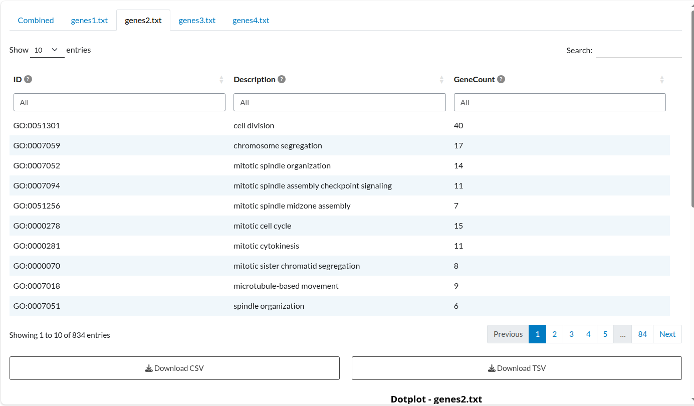
Figure 4: Individual Analysis: Dataset 2. Independent enrichment results for the ‘genes2.txt’ list, displaying term significance specific to this study.
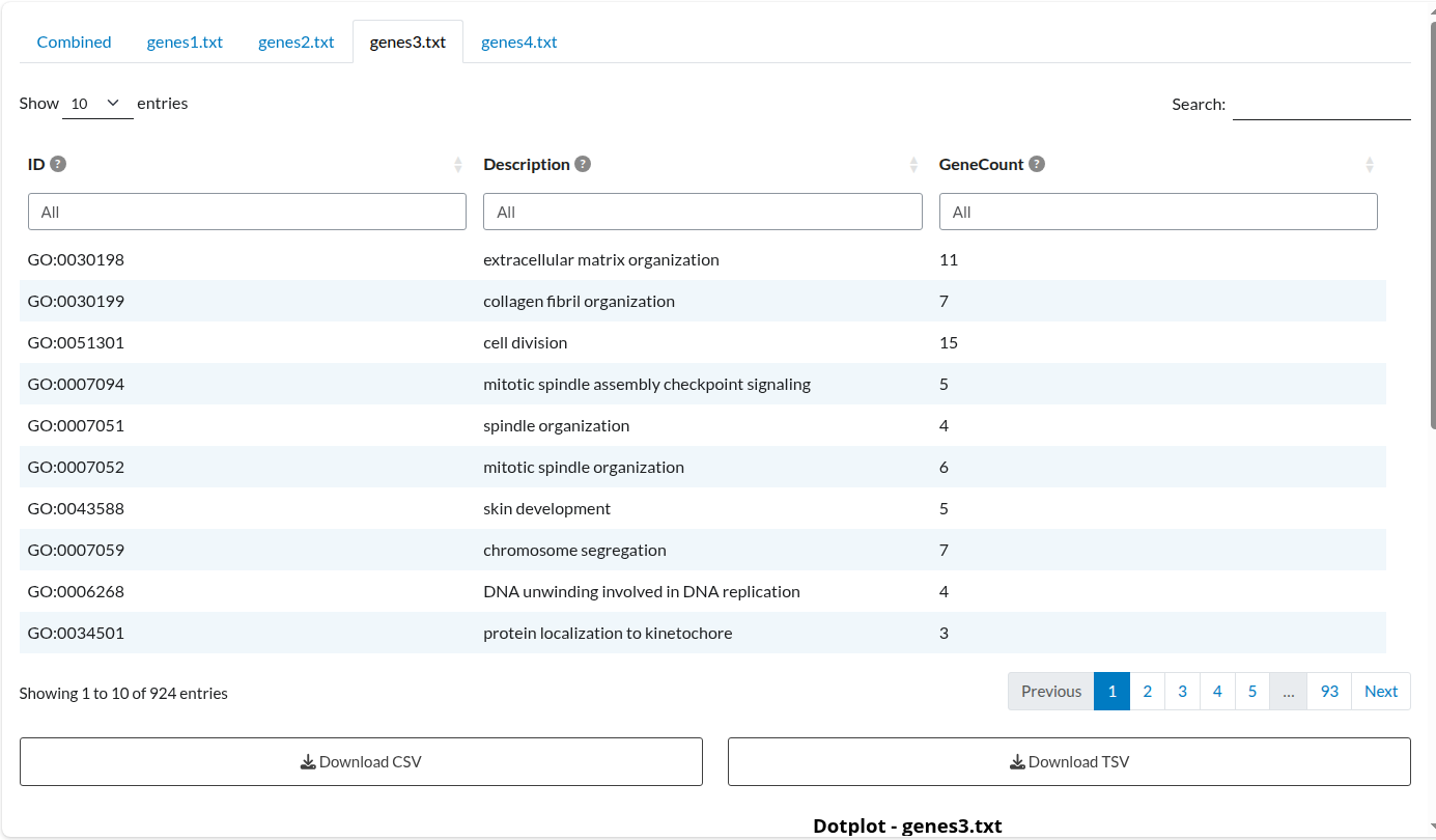
Figure 5: Individual Analysis: Dataset 3. Independent enrichment results for the ‘genes3.txt’ list, displaying term significance specific to this study.
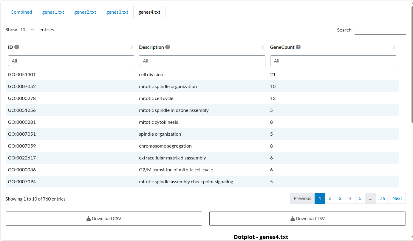
Figure 6: Individual Analysis: Dataset 4. Independent enrichment results for the ‘genes4.txt’ list, displaying term significance specific to this study.
3.4.2 Excluded terms table
In this example, filtering was applied to exclude terms that appeared fewer than three times in the dataset. The information that was excluded from the main table is displayed here.
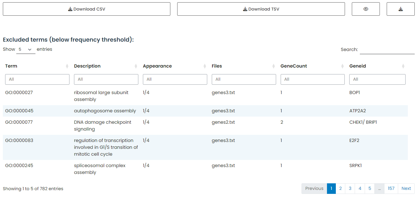
Figure 7: Excluded Terms Table. Displaying enrichment terms that did not meet the minimum recurrence threshold (appearance in < 3 datasets), providing transparency regarding data excluded from the final consensus.
Warning
The terms displayed in this table only reflect exclusions based on the minimum dataset appearance parameter (≥3 appearances). Internal filters applied within the table, such as searching for “cell” or setting an interval for GeneCount, do not affect this exclusion list.
3.4.3 Interactive Dot Plot
Visualizes only the filtered subset, displaying terms related to “cell” and with a
GeneCountof 20 or higher.The plot is exported as a
htmlfile, providing dynamic interactivity with hover tooltips.
Figure 8: Filtered Interactive Dot Plot. Dynamic visualization representing only the specific subset of terms matching the user’s filter criteria (keyword ‘cell’ and GeneCount ≥ 20), rendered as an interactive HTML element.
Note
In this example, only the combined plot is displayed.